Firefox 4 gets a clue, plus Bonus Track
Apparently the people at Mozilla finally decided to give their last Firefox release a try on a Linux/Gtk+ configuration other than Ubuntu 10.10’s default, or some diligent user reported to them how awful the new interface looks to the rest of the world who’s not using Windows. In any case, I seem to be receiving new builds through their beta channel, and a few hours ago I got my hands on Firefox 4.0.1 “beta” build 1, whatever that means.
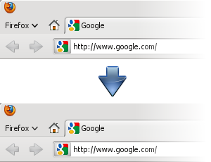
The following picture should speak by itself: (Hint: look between the Firefox button and the toolbar.)

Before switching to Mozilla Firefox 4’s builds from the Nightly (Minefield) channel some time around mid-2010, I used to follow closely the blog of one of the Debian Iceweasel maintainers, from which I got goodness such as updates on the status of Iceweasel 3.6 for Debian Sid/Squeeze in Experimental, that I used for a while.
There’s a little piece of customization advice for Iceweasel/Firefox 4.0 users posted around January that I overlooked until now.
Turns out that this night after Firefox 4.0.1’s update, I decided that the “Firefox button” should match the Oxygen window decoration in style — because I’m that crazy. I took the ~/.mozilla/firefox/<session>/chrome/userChrome.css modifications from the blog post and played around with various combinations until I produced something marginally uniquer.

#appmenu-toolbar-button > .toolbarbutton-text {/* oxygen "carved" effect */text-shadow: 0px 1px 0px white;/* bold */font-weight: bold;}
I am actually afraid of messing around with the many possibilities of XUL/CSS styling further, lest I spend the rest of the month producing my own full-fledged Firefox theme. The fact that I can handle CSS makes this all the more worrisome.