The problem with Firefox and toolbar icons
The other day I said:
If one takes any XUL (e.g. Firefox, Thunderbird) application and tests it against Gtk+ theme engines or color schemes other than the Ubuntu defaults, various design shortcomings become evident, including things such as the developers’ inability to choose a toolbar icon set for Linux/X11 that doesn’t become uncomfortably unreadable against bright backgrounds.
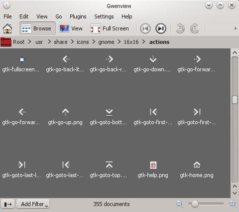
I have to apologize for not doing the research on the icon part of this particular statement. It turns out this isn’t Firefox’s fault; it is just using the platform icons as it’s supposed to do on Linux/X11 since version 3.0 or so. So where do these icons come from? Let’s take a look at chrome://browser/skin/browser.css:
/* 24px primary toolbar buttons */#back-button {list-style-image: url("moz-icon://stock/gtk-go-back-ltr?size=toolbar");}#back-button[disabled="true"] {list-style-image: url("moz-icon://stock/gtk-go-back-ltr?size=toolbar&state=disabled");}
Since I use the Oxygen style in KDE for Qt 4 applications, I have set Oxygen Gtk for Gtk+ 2 and Gtk+ 3 applications, so those applications will use the Oxygen icon theme as well. But checking /usr/share/icons/oxygen/16x16/actions/, there are no files named gtk-*.png like Firefox wants. So it must obviously be using icons from the GNOME theme instead.

Bingo.
Mozilla’s decision to have Firefox use native icons on X11 seems questionable to me, since it breaks cross-platform consistency and tends to look like crap (compare Firefox on Windows, even on XP). But the actual bug here is quite clearly not theirs. The icons in question come from the gnome-icon-theme (3.4.0-2 installed) in Debian, and according to its copyright file:
It was downloaded from http://download.gnome.org/sources/gnome-icon-theme/
One would think these people know better than this since there are other popular Linux distributions out there using bright color schemes by default, such as Fedora. The good thing about colorful icons is that they are generally designed to stand out regardless of the background color; it’s quite hard to achieve the same effect with monochrome designs.