A Matter of Personal Preferences
Now that Battle for Wesnoth 1.9.6 has been tagged, we can once again focus on the future!
I’m not exactly the resident usability expert in the Wesnoth development team (multiple people have claimed that title under dubious circumstances before) but I believe I can recognize a design issue when it’s in front of me.
The issue in question is the game’s Preferences dialog. Over time it has accumulated needless cruft in the form of options that no-one should ever need to use, which are nevertheless offered to the player under the Advanced Preferences section. Funnily enough, the programmatic design of this area lends itself to random developers and patch contributors senselessly throwing crap into it; this is the only piece of user-visible configuration that can be defined almost entirely in WML, requiring only a couple of accessor functions in the C++ side for whatever module needs to query or set those options at runtime. In the “best” case, just a single getter suffices.
Of course, Preferences is built upon the previous Wesnothian GUI toolkit jokingly referred to as “GUI1”. Despite what some people may say, it’s far from ideal to work with hardcoded widget locations and an inflexible rendering scheme. As new options have been added to the game, developers have preferred to do things the lazy way and abuse Advanced, leading to arguably essential entries getting clobbered in middle of the rubble.
Naturally, I tried to tell people about this problem. But since it’s been nearly a week and I’ve not gotten reactions of any kind, I decided to start chopping trees.
 →
→ 
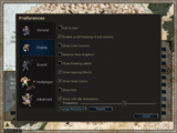
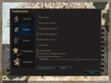
The main thing here is that the Enable scroll tracking of unit actions and Reverse Time Graphics options were moved to Advanced, and in their stead I brought Show Unit Standing Animations and Animate Map, and messed around with some spacing.
With Wesnoth 1.9/1.10 boasting a plethora of standing unit animations and animated terrains, a performance drop is to be expected on low-end machines — or even high-end as well, depending on what other processes are running in the background and local factors such as map size, amount of visible units and possible targets during AI turns. Increasing the visibility of performance impacting options makes a lot of sense if it will result in less complaints. 😉
 →
→ 
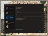
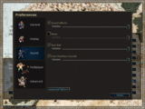
If one looks hard enough, it’s always possible to find other details to nitpick. A little patch went into 1.9.7 to add some indentation and change font sizes for slider labels in Preferences that were associated to checkboxes, but I preferred to leave the follow-up for 1.9.8 — the Sound tab sliders had some overly verbose labels that truly only served to give translators three extra strings to manage.
That said, Preferences still glitches at the bottom on the minimum resolution of 800x480 pixels. The effect can be seen here on the Close button itself. I don’t think I’m able or particularly interested to tame this beast, however, so fixing it may have to wait for the GUI2 redo of the dialog. Meanwhile, OpenPandora users will have to do with this minor inconvenience.
• • •
I should note that my original plan was to completely scrap the Reverse Time Graphics option. After doing some research, I discovered that ESR did it once, and that it got reverted the next day by alink. The rationale? I’m not sure, but the IRC logs are quite entertaining.