GUI2: Editor Settings, Starting Positions and Uninstall Add-ons
After completing the first episode of After the Storm, a short vacation was a logical option so I could return to work later with fresh ideas and more energy. By ‘vacation’ I don’t mean a traditional Wesbreak as most people do, though — quite the contrary, in fact.
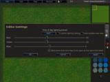
For a long time I’ve been bothered by the haphazard-looking design of the Editor Settings dialog. This (already GUI2) dialog’s main focus is a bunch of lighting options intended for map or terrain authors to test what their creations look like under different Time of Day lighting presents, or even custom lighting, which is also useful for campaign designers trying to come up with an atmospheric feel within Wesnoth’s rendering engine limitations.
 →
→ 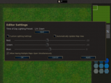
I don’t claim to be a UI design expert — I’m fairly certain I’m not — but I feel my vision of the dialog is better than the original author’s, and for this reason I recently committed to trunk these changes along with a couple of fixes for related long-standing bugs that were definitely not introduced by me. I think. I hope.
I am not keen on having Title Case on checkboxes, either, but for some reason the wiki says it’s what we should use, so I’m going to stick to that for 1.10 as it’s already used in most places anyway. I hope we can clear that up during the 1.11.x development cycle since even GNOME’s Human Interface Guidelines recommend sentence case for such elements.
(Note to self: rephrase the MDI option label again since “allow having” doesn’t sound proper at all.)
 →
→ 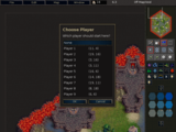
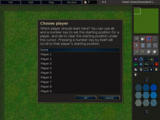
The item selection menu triggered by the Starting Position tool in the editor was a generic GUI1 dialog, until now. I decided to tackle this conversion task and add a feature in the process: existing starting locations are shown in the second column of the player list, in the form of map coordinates. This is not too helpful since we already had keyboard shortcuts to reach starting locations in the map editor (1-9 number keys), but in my opinion looks nice. The giant help tip in the dialog description had to go though, but don’t worry, for the tooltip on the editor palette already provided the exact same information in a more consistent fashion with regard to the other editing tools.
 →
→ 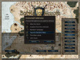
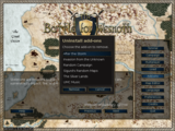
And finally, something more useful for the large majority of the userbase: removing multiple add-ons at once without having to return to the Uninstall Add-ons menu. I have not committed this to trunk yet, though, and I’m not even sure I’ll be able to merge it before the feature freeze in preparation for the final lap towards 1.10 comes into effect.