Web browsers and UI design divergence
Web browsers break any established GUI design molds and this is no news for us. It was a necessity to create new controls (also known as widgets) in the ’90s when the Web was still a new, unknown thing and no common consensus on how users should interact with it existed. However, with time this practice has lost some of its technical grounds to become more of a profitable marketing strategy used by giants such as Mozilla and Microsoft to create distinct looks for their products.
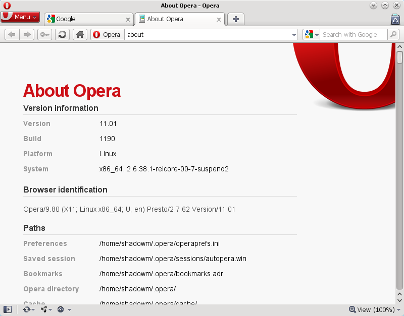
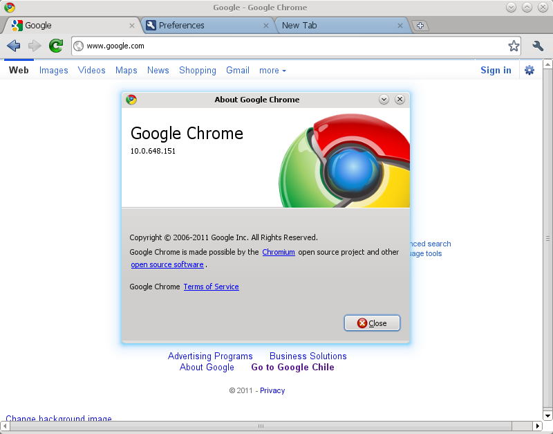
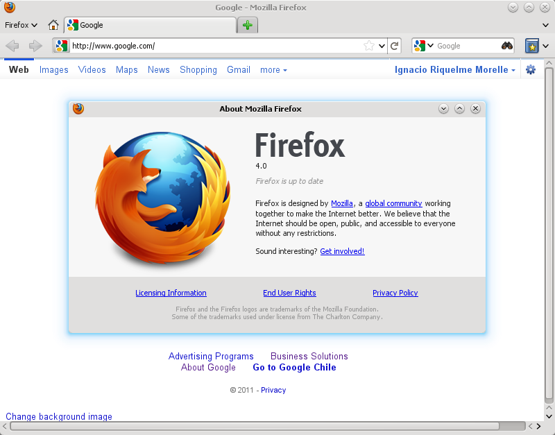
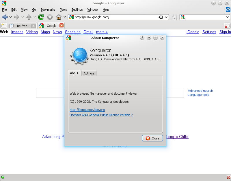
Above we can see four browsers I personally consider major players in the GNU/Linux ecosystem in particular. From left to right, top to bottom in descending order of wheel reinvention and UI differentiation, we have: Opera 11 (???), Google Chrome 10 (GTK+), Mozilla Firefox 4.0 (XUL/GTK+) and Konqueror (KDE/Qt4) from KDE SC 4.4.
At the lower end, we have Konqueror, which has been designed to blend in with its parent application suite, the KDE desktop environment, so it uses a common visual design instead of inventing its own. At the top there’s Opera, a cross-platform browser that is not part of any specific suite and attempts to keep a consistent internal look between different operating systems, resulting in various reimplemented controls with different, custom functionality and a visual design unique to this software product.
In the middle we have Google Chrome and Mozilla Firefox, which have chosen to use the GTK+ toolkit to avoid reimplementing too much and concentrate on their actual business, that is, web browsing. But something’s horribly off about these two.
In Google Chrome’s case, we have a default, “Classic” theme that presents the user with the distinctive Chromium look and feel but keeps the standard GTK+ application design for modal dialogs. Embedded input controls in web pages such as checkboxes and unstyled command buttons appear to be rendered by a custom engine using Chrome’s own ideas of what a widget should look like. As Chrome belongs in the GTK+ territory like all of the GNOME desktop environment, this makes it really stand out as an individual application that behaves and looks like nothing native to GNOME or other GTK+-based environments. As an alternative, we can choose to use the “GTK+ theme” in the application’s preferences, which does nothing but switch the color scheme to respect the user’s desktop preferences a bit and fallback to GTK+’s icon paths for some (not all!) toolbar buttons.
This so-called “GTK+ theme” keeps the hideous low-contrast, Chrome-style scrollbar in the web page view area as well, basically mocking users who would hope for some desktop consistency and accessibility by choosing this option.
Mozilla Firefox provides an interesting case. Powered by the XULRunner framework, it aims to blend in with every one of its target platforms, using native Windows controls on Windows and GTK+ as a backend on Linux. However, someone didn’t get the memo with the main window’s tab bar, and instead of native GTK+ versions we get awful customized tabs that do not respect the user’s chosen GTK+ engine. It seems that in Firefox 4’s particular case the developers intended to achieve something closer to Opera in design, which worked in Windows, but didn’t get completed for Linux — probably due to time constraints and lack of volunteers to do the grunt work required in the coding area. Firefox 4 in Linux currently barely resembles the original mock-ups. (To their credit, those mock-ups showcase a really elegant — if somewhat unoriginal — design that is too unfortunately missing in the RTM builds.)
The current strategy appears to be all too profitable right now for these people to abandon it. We’ll probably just see more development in the GUI design department from web browser vendors than operating systems and desktop environments in the near future.