GitHub and long CIA commit notifications

Ever since I started using GitHub I have been greatly bothered by the questionable design decision of sending only the first line of a commit message to CIA.vc — the service that allows us to get instant commit notifications on IRC channels. For people using Git like it was intended to be used, this means you will only see the subject line for each commit in your CIA notifications and the web feed.

That’s not my only reservation about GitHub’s custom CIA hook’s design, in fact. It also limits the amount of notifications sent per push to five; more commits than that get notified as a single commit along with a “(+n more commits)” notice in the message. While everyone knows that CIA is broken by design and all, it just doesn’t feel right to me that GitHub should be in charge of manipulating notifications to avoid flooding and all. Whatever, I say.

Regardless of CIA’s perpetual state of brokenness, there is something that it currently does right. CIA bots won’t flood a channel with more than a few message lines per commit. One could then assume that this renders GitHub’s single-line commit notifications entirely pointless, but there might be people who really want their CIA bot to behave like a continuous git log --format=oneline run without figuring out a complicated CIA formatting ruleset specification.

I am definitely not part of that crowd, but I respect people’s right to choose, so I decided to provide them with the choice to get full commit messages sent to CIA.vc. The relevant pull request has just been accepted.

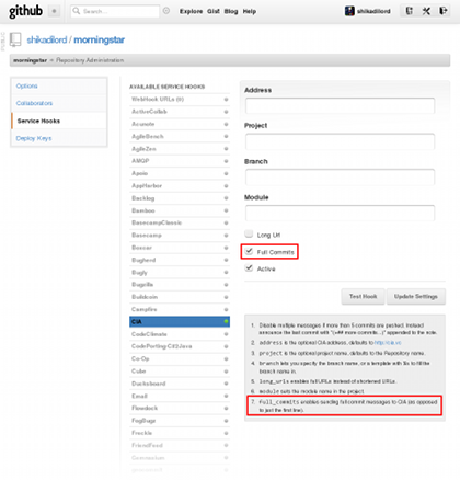
This is what the CIA hook configuration looks like in production now:

CIA hook configuration

I have gone and enabled the option for every repository I currently host at GitHub that’s already using the hook. If you really care about proper Git commit message formatting (or merging commits from people who do) and you are also using CIA, I urge you do the same.

It should be noted that the single commit in that pull request is my very first attempt at writing code in Ruby at all.

Wesnoth RCX 0.2.1

A new release of Wesnoth RCX is now available for download!

  • Source code: wesnoth-rcx-0.2.1.tar.bz2 (Bzip2 tarball, 106.8 KiB)
    SHA1 checksum: ed114fb2776254a89491c0c014efb6da500693e0
  • Windows: wesnoth-rcx-0.2.1-win32.zip (Zip archive, 4.9 MiB)
    SHA1 checksum: e6ed82f6a914d52a799527637562bfb4f5baa61b
  • Mac OS X: wesnoth-rcx-0.2.1.dmg (Application image, 16.7 MiB)
    SHA1 checksum: 221c0006ce8beed5d81f4a9637629a12d4fe0730
    Contributed by Alarantalara.

Shortly after 0.2.0 was released, it was brought to my attention that it wouldn’t compile against Qt versions older than 4.8.0, even though the documentation says it should work with version 4.6.0 and later. I quickly amended that and published a patch (found amongst the 0.2.0 downloads in the previous announcement) addressing those issues. That patch is obviously no longer necessary, since the compatibility changes are integrated in 0.2.1 and later. Furthermore, I now have easy access to a build environment using 4.6 to ensure such a situation does not occur again.

A well known issue at the time 0.2.0 was released was some rather excessive memory usage when zooming in, especially for large pictures. 0.2.1 solves this by using a more conservative approach for zooming; in a particular case this decreases memory usage from around 1.1 GiB to just around 50 MiB.

Wesnoth RCX now remembers the main window size and the preview background color each time. Additionally, it’s now possible to apply TC to a whole color palette in the Palette Editor dialog, using the new Recolor option.

Finally, a few minor interaction issues were fixed in this release, including the Add from List option (Palette Editor) being available and non-functional when no palettes are selected.

Bugs and feature requests should preferably be posted to the issue tracker at Github so I don’t have a chance to forget about them.

Of course, as usual you can provide other kinds of feedback through the Wesnoth.org forum topic and this announcement post. It would be nice to hear from you if you use this software, regardless of whether you liked it or not — any feedback is appreciated here.

•••

Go test and create, and have lots of fun!

Wesnoth RCX 0.2.0

The new major feature release of Wesnoth RCX is now available for download!

  • Source code: wesnoth-rcx-0.2.0.tar.bz2 (Bzip2 tarball, 103.3 KiB)
    SHA1 checksum: 158f0f8e98aeb852e6265aa8cae83a3f01454f38
  • Windows: wesnoth-rcx-0.2.0-win32.zip (Zip archive, 5.0 MiB)
    SHA1 checksum: 14d2fb244ff1f45968d9104b55013f43a95f451a
  • Mac OS X: wesnoth-rcx-0.2.0.dmg (Application disk image, 17.4 MiB)
    SHA1 checksum: 2d8221a6002d37cc352cfa2a67938afd7b9596e3
    Provided by Alarantalara.
  • Patch: qt-4.6-4.7-compatibility.patch (Source code patch, 6.5 KiB)
    SHA1 checksum: e9e800c98bdb79c234d536277bfb5d3ea9014a89
    You only need to apply this patch if you are building version 0.2.0 from source using Qt 4.6.x or 4.7.x. Run qmake -v in the console to see the Qt version in use.

The project page on this very site has been updated accordingly, and split from the main Wesnoth-TC page.

One year and nearly eight months have passed since the last release, version 0.1.4. There was very little activity for most of the time until July this very year, although the primary release goals had already been long established.

The new built-in palette and color range editors allow creating and modifying these items for the game’s recoloring engine with ease, as well as generating WML definitions for your use in add-on production and testing. Various user interface improvements and additions, such as a Recent Files section and a Reload action, allow for a smoother workflow. The redesigned main window now supports scrolling large and zoomed-in images, as well as dragging any of the previews to other applications accepting graphic drops, such as the GIMP.

This version also sees the addition of menu options to change the preview background color, cleaner file output notifications, an enhanced Windows build process with embedded version and icon attributes, and a simple make install target for Linux/X11 users building from source. The included documentation has been improved in this release as well.

Some of the known issues with this release are mentioned in the BUGS file included in the source code tarball; other issues have been fixed after the release, in the master branch in the public Git repository.

  • The unmodified 0.2.0 source code distribution will not build using Qt 4.6 or 4.7 without the patch provided in the Downloads section above. This issue was—rather unfortunately—discovered after the release was tagged. The fix has been committed to Git already.
  • Zooming in requires extremely large amounts of CPU time and memory, especially for images larger than 72x72 pixels at zoom levels greater than 200%. It’s advised that you avoid zooming in unless you have at least 2 GiB of RAM available.
  • Zooming does not preserve the current viewport, indiscriminately recentering it instead.
  • The preview background color choice is not persistent across re-runs. This has been solved in Git already.
  • The dialog shown by the Add from List option in the Palette Editor may have the help text cut off depending on your display and font configuration
  • Dragging previews is not always possible on Linux/X11, depending on the Qt 4 style engine in use. A workaround has been implemented for the Oxygen style (KDE workspace default), but other styles that allow dragging windows from empty areas may ‘steal’ Wesnoth RCX’s events.
  • Dragging previews to Windows Paint does not currently work, presumably because the application expects to get access to a file on disk. Since Wesnoth RCX does not store the recolored image on disk until the user requests it, this problem might be impossible to fix.
  • The Windows build might occasionally crash during the initial file open dialog, apparently whenever a directory takes too long to display. This does not seem to happen later during execution.
  • The Windows build might display occasional minor glitches with mouse-over decorations on buttons and radio/checkboxes when running on Windows XP with styles supporting them (e.g the default Luna style).
  • The Add from List button in the Palette Editor remains enabled at times when it cannot do anything useful (e.g. when there are no palettes to select and edit). This has been solved in Git already.

With the move to Github came a few goodies; in particular, there is now an official tracker for bugs and feature requests for those who desire a better, supported alternative to the Wesnoth.org forum topic and these blog announcements.

As usual, you can also provide other kinds of feedback through those two aforementioned channels. It would be nice to hear from you if you use this software, regardless of whether you liked it or not — any feedback is appreciated here.

One problem in terms of development and testing is that I do not currently own a Mac machine, nor do I really intend to. This means I have to rely on certain assumptions and avoid doing anything too crazy that is not guaranteed to work on all platforms or—in particular—widget style engines. So far this appears to have worked fine, thanks to Qt’s cross-platform design.

The Windows (Win32) build has been tested much better in that regard, since my current development machine also functions as a decent VirtualBox VM host. I have gone to rather great lengths this time to improve the build by adding some embedded information to blend better with the environment, and including the Qt library in the wesnoth-rcx.exe executable itself, thus removing the need for two DLLs in the distribution.

Testing on Windows and Mac OS X feels really important to me, given my target audience; most artists seem to prefer these mostly hassle-free operating systems, and I fully respect that choice. My goal is to reach as many artists as possible with a useful and powerful tool that does not get in the way of the creative process, unlike the Wesnoth game proper, so it’s important to ensure a minimum quality level for each release that is consistent across the three main supported platforms.

I have done a lot of work coding and testing this release on Linux (Debian wheezy), Windows XP, and Windows 7, and I hope there aren’t any showstoppers left in this version. However, as you can see above, there is still quite a lot left to do in terms of polishing. Depending on feedback, a new 0.2.1 release might be published in the upcoming weeks. However, many of the remaining bugs require more meticulous inspection and extensive design changes; those will not happen until 0.3.0.

In the meantime, go test and create, and have lots of fun!

UPDATE 2012-08-15: the Mac OS X binary is up now.

Wesnoth-TC 1.5.1, and the future

Wesnoth-TC 1.5.1 has just been released... or maybe not. It has actually been tagged for more than 24 hours already.

This version is really just a bug-fix release, which is why it’s not 1.6.0. In fact, it only really addresses some build-time issues that have cropped up over the last couple of years.

Both distributions come with a README file, and the source code distribution also includes an INSTALL file with detailed instructions for configuring, compiling and installing Wesnoth-TC. The Windows binary distribution doesn't require any installation besides unpacking it into an appropriate directory — which you may optionally add to PATH.

Long ago, this came into existence. At the time, I needed a quick way to preview my own team-colored unit sprites without going through the hassle of starting/restarting Wesnoth (or its internal cache), loading a saved game, and creating units in debug-mode. That was my initial motivation for writing Wesnoth-TC, and since it was tailored to my specific needs, it was born as a console application. I later decided to publish and extend it, hoping that someone else would provide a good full-featured user interface for it.

Actual artists prefer using graphical user interface applications on Windows and Mac OS X, and with good reason. That’s the software interaction paradigm that suits visual types better for obvious reasons, and that’s why I took it upon myself to write a larger GUI front-end for Wesnoth-TC that could be built and run on the three major platforms from a single code-base.

That front-end quickly became an adaptation of the original back-end code. And thus Wesnoth RCX became an entirely separate project sharing little more than a bit of history with Wesnoth-TC. And most importantly, Wesnoth RCX became the first GUI (Qt 4) application I have ever written.

Over time, my needs and personal preferences have changed. Wesnoth-TC now feels largely inferior to RCX merely because of the lack of a native front-end for it. RCX has also recently gained visual palette and color range editing capabilities, which renders Wesnoth-TC’s definition file system somewhat obsolete. Furthermore, RCX has continued to compile and run correctly over time regardless of the Qt 4 version currently installed, whereas Wesnoth-TC has broken in a few occasions with newer development environments.

Wesnoth-TC truly feels like a relic now, one I don’t really want to continue developing at this time when I feel RCX is more fun to improve and work with. I had plans to eventually integrate a full-fledged implementation of the Wesnoth Image Path Functions mechanism, but that seems over-ambitious right now.

So, yeah, Wesnoth RCX is the future. Stay tuned for version 0.2.0, coming soon with more features and improvements.

Wesnoth-TC and Wesnoth RCX moved to Github

I have just finished moving Wesnoth-TC and Wesnoth RCX to Github — in my humble uneducated non-expert opinion, a much nicer place to be than Gitorious, which still lacks native CIA.vc support after all these years. Instead, Github supports CIA.vc and a large amount of alternatives which I’ll probably never use.

The project page on this website has been updated accordingly. If you were tracking the repositories at Gitorious, you will not be able to get further updates unless you update your configuration to point to the new locations:

  • Wesnoth-TC:
    HTTP transport: https://github.com/irydacea/wesnoth-tc.git
    Git transport: git://github.com/irydacea/wesnoth-tc.git
  • Wesnoth RCX (codename Morning Star):
    HTTP transport: https://github.com/irydacea/morningstar.git
    Git transport: git://github.com/irydacea/morningstar.git

Updating client repositories is actually far easier than it sounds:

$ git remote set-url origin <new URL>

Afterwards, you should be able to fetch/pull as usual.

This switch actually began some time ago when I was considering resuming Wesnoth RCX’s development (which stagnated ‘some’ time ago too). It took a while, but I finally seem to be back on track, all thanks to my currently unannounced self-imposed campaign development break — a break that should allow me to get back to business soon enough, with the renewed energy and coder momentum I will seriously need in order to pull it off.

Wesnoth RCX 0.2.0 will probably be released before the end of this week, as soon as I make sure everything works as intended, which will be less trivial this time due to the new shiny features it packs. There’s also a couple of Windows-specific oddities that I want to tackle before releasing.

Oh, and in the meantime there will be an update regarding Wesnoth-TC’s future.

The problem with Firefox and toolbar icons

The other day I said:

If one takes any XUL (e.g. Firefox, Thunderbird) application and tests it against Gtk+ theme engines or color schemes other than the Ubuntu defaults, various design shortcomings become evident, including things such as the developers’ inability to choose a toolbar icon set for Linux/X11 that doesn’t become uncomfortably unreadable against bright backgrounds.

I have to apologize for not doing the research on the icon part of this particular statement. It turns out this isn’t Firefox’s fault; it is just using the platform icons as it’s supposed to do on Linux/X11 since version 3.0 or so. So where do these icons come from? Let’s take a look at chrome://browser/skin/browser.css:

/* 24px primary toolbar buttons */
#back-button {
list-style-image: url("moz-icon://stock/gtk-go-back-ltr?size=toolbar");
}
#back-button[disabled="true"] {
list-style-image: url("moz-icon://stock/gtk-go-back-ltr?size=toolbar&amp;state=disabled");
}

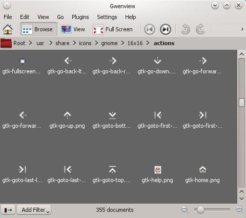
Since I use the Oxygen style in KDE for Qt 4 applications, I have set Oxygen Gtk for Gtk+ 2 and Gtk+ 3 applications, so those applications will use the Oxygen icon theme as well. But checking /usr/share/icons/oxygen/16x16/actions/, there are no files named gtk-*.png like Firefox wants. So it must obviously be using icons from the GNOME theme instead.

Bingo.

Mozilla’s decision to have Firefox use native icons on X11 seems questionable to me, since it breaks cross-platform consistency and tends to look like crap (compare Firefox on Windows, even on XP). But the actual bug here is quite clearly not theirs. The icons in question come from the gnome-icon-theme (3.4.0-2 installed) in Debian, and according to its copyright file:

It was downloaded from http://download.gnome.org/sources/gnome-icon-theme/

One would think these people know better than this since there are other popular Linux distributions out there using bright color schemes by default, such as Fedora. The good thing about colorful icons is that they are generally designed to stand out regardless of the background color; it’s quite hard to achieve the same effect with monochrome designs.

Unswitching browsers

I could not bear using Chromium for a week as I originally intended. All right, I admit I always intended to go back to Firefox, but the whole exercise didn’t go as planned for various reasons.

The thing is, I have always used Firefox since version 1.0 or so and it has basically become part of my personal life — it’s impossible for me to stay mad at it for too long after all we have been through together.

Nothing of this renders the points I previously raised here any less valid, but I have coped with those annoyances for a good while already — let’s not get too demanding in the usability department here, otherwise I may as well invest a zillion dollars in Apple products right now.

Besides, Chromium insists on taking up preposterous amounts of CPU time in the background every once in a while, even after getting rid of a certain bug with the Linux kernel and leap seconds. Despite all its inefficiencies, I have never seen Firefox indulge in such erratic (and potentially harmful for laptops) behavior like that while idle. I already did my best to diagnose the issue, but I never had that much interest in using Chromium as my primary web browser in the long term anyway. After all, I am a KDE user, which means I like options — the Chromium design philosophy is more or less the antithesis of that, and it shows.

There’s also these two seemingly minor annoyances, and this — which makes more sense if you take this (from about 10:58 hours earlier) into consideration.

Not to mention that there’s no Chromium add-on providing a Bookmarks menu that looks nice, probably due to the previously mentioned design limitations. It’s also somehow more natural for me to have the Home button at the right end of the toolbar, but this might just be Firefox inculcating habits.

Going back to Firefox, it does seem like resetting its configuration and clearing all of my old web history before March 2012 improved overall performance. In case someone else wants to try resetting their own configuration:

  1. Backup your profile or the whole .mozilla directory (on Linux/X11, no idea about other platforms);
  2. Go to the about:support page, and choose the Reset Firefox option;
  3. Follow the instructions on the screen to create a new profile preserving your browsing history, bookmarks, cookies, and saved passwords.

When done, you will be left with an additional copy of your old profile that might or might not still work — I didn’t check this. You can start Firefox with the -P switch to see the previous profile, and possibly delete it after you are done making sure all the information you need is present in the new one. You will lose all your installed add-ons, their configuration, and your browser preferences; this is pretty much the whole point of the procedure.

I for one had accumulated heaps and heaps of unused or obsolete configuration entries (both from add-ons and old Firefox versions) carried over since late 2008. That can’t possibly be healthy, especially considering that I have tried many, many add-ons and hidden configuration options over the years, and used pretty much all versions since Firefox 3.0.

It’s probably more important to keep the web history under control, though. Older versions of Firefox—if I recall correctly—had a user-visible option in Preferences to limit history to a given amount of time, but that doesn’t seem to be the case as of Firefox 13 and it’s all or nothing. Of course, it’s also possible that the current defaults do limit history and there simply isn’t a way to change that limit anymore; so if I ever changed it with a previous version, it would have become inaccessible to me later short of using about:config.

The Treachery of PNG Images

These two images are not the same, at least if you are using the default Firefox configuration on Linux/X11 with gfx.color_management.mode set to 2 (only tagged) instead of 0 (all disabled). It turns out I disabled that setting entirely at some point—for some reason—and later forgot about it.

To be more specific, the image to the right is the intended rendering. This is what the side-by-side comparison above should look like with the defaults.

It also seems I have been leaving behind a trail of PNG files in the web that contain bogus ICC information that causes Firefox—again, with the default configuration—to render them differently than I actually intended when exporting them in the GIMP. In the case of my avatar, it’s not a big deal since it’s just Xykon from the Order of the Stick serving as my terrifying spokesman spokeslich. However, if my memory serves me right I have seen this being an actual issue with my whole website layout in my default-configured virtual machines — and I always dismissed that color disparity as being caused by VirtualBox instead of Firefox.

Thankfully, the website CSS currently makes more use of browser gradients to prevent the faulty (?) graphics being used in practice. The spritesheet that contains the post category icon (used in the front page) is evidently affected, though.

But to what degree is it Firefox’s fault? Unfortunately, I understand jack shit about color profiles and I don’t seem to have a tool handy to tell me what the technical differences between both images are. I suspect I did something wrong in the GIMP at some point, or perhaps the problem was created by my application of a certain PNG optimization script. Does the wrongly rendered version of my avatar actually have color profile information in it?

What I do understand is that color profile information in PNG files has bitten my ass several times over the years, and not just with Firefox, but also with Wesnoth (via SDL_image).

If anyone there thinks they have a definitive answer to this conundrum, please share.

EDIT: Yes, I reuploaded my avatar to the Wesnoth.org forums and my Twitter profile during the last couple of days in order to fix this issue. It was just matter of opening importing the current versions in the GIMP and then saving exporting the unaltered contents to new files. I will probably try the optimization procedure on the fixed versions later.

EDIT 2: Also, yes, I am aware that the two sample images look identical in non-Gecko browsers.

After the Storm 0.8.1

Version 0.8.1 is out, right on schedule!

Just like the last time, this version will definitely not be exempt of flaws. You will most likely stumble upon dreadful bugs along the way, and I will need your help to fix them — make sure to report them in the campaign’s forum topic as usual!

Special thanks go to bumbadadabum for kindly providing a patch to integrate the changes to the Aragwaithi faction from his multiplayer add-on (The Aragwaithi in the 1.10 add-ons server) into AtS. 0.8.0 users shouldn’t have any game-breaking problems playing with their old units from saved games of E3S3 (Amidst the Ruins of Glamdrol), although some animations may not display correctly. If in doubt, restart from the start-of-scenario save for E3S3.

Also note that due to an internal change, if you load the start-of-scenario save for E3S4 (Outpost of Hell) from version 0.8.0, you will see the loadscreen twice. This is normal and intended, and only affects old saved games for that scenario.

This release is a turning point for various reasons I had already explained a while ago. The good thing is that once scenarios stop landing in SVN, I no longer need to worry about release schedules and pacing. I can now start pushing bug-fix releases as necessary, without affecting the development of the campaign finale.

It is also a turning point in other senses that attentive players will most certainly realize on their own. But in case someone feels disappointed by certain developments: I left enough clues scattered everywhere before, and everything is going according to plan. The bottom line is: if you don’t like the story and you can’t ignore it, don’t play the campaign. And just to be clear, it has never been my intention—at least since I resumed its development in 2011—for it to be eligible for mainline or anything like that.

The changelog for this version follows:

Version 0.8.1:
--------------
* Graphics:
* New or updated unit graphics: most Aragwaith units (wayfarer).
* Scenarios:
* E2S3.1 - Unrest in Raelthyn:
* Updated to use Aragwaith units.
* E2S8 - And then there was Chaos:
* Fixed elves who are initially Loyal getting a duplicate
trait when switching allegiances.
* E3S2.1 - Return to Raelthyn:
* Minor map balancing changes.
* E3S4 - Outpost of Hell (Gateway):
* New scenario.
* E3S5 - Pass of Sorrows (Gathering Storm):
* New scenario.
* Sound effects:
* Added hit and death sounds for Doors.
* Added additional explosion/thunder sounds.
* Added magic glyph sounds.
* Units:
* Balancing:
* Removed marksman special from the Demolisher Drone's ranged attack.
* Increased Sprite's impact resistance from -20% to 0%.
* Increased Fire Faerie's impact resistance from -20% to 0%.
* Increased Dryad's impact resistance from -10% to 0%.
* Increased Aragwaith Seer's HP from 39 to 44.
* Increased Aragwaith Seer's melee attack from 7-2 to 8-2.
* Increased Aragwaith Seer's ranged attack from 8-3 to 10-3.
* Decreased Shaxthal Razorbird's melee attack from 10-1 to 8-1.
* Decreased Shaxthal Thunderbird's melee attack from 13-1 to 10-1.
* Gave Doors a unit icon for the sidebar and the attack dialog.
* Updated Aragwaith units to match the faction from bumbadadabum's
"The Aragwaithi" add-on. This has resulted in the following changes:
* Protection only affects allied L1 and L0 units instead of any allied
lower level unit
* Ancient Banner abilities: +leadership, -protection, -steadfast
* Ancient banner resistances: impact 10% -> 20%
* Ancient banner stats: HP 55 -> 58, MP 4 -> 5
* Ancient banner attacks: sword renamed to scythe
* Archer attacks: melee 6-3 -> 4-3
* Captain abilities: +leadership, -protection, -steadfast
* Captain resistances: blade 20% -> 10%, fire 10% -> 0%, cold 10% -> 0%,
pierce 20% -> 10%
* Captain stats: HP 43 -> 55, MP 4 -> 5
* Captain attacks: spear renamed to glaive, 17-2 -> 18-2; sword renamed to
glaive, 9-4 -> 10-4
* Eagle Master stats: HP 48 -> 45, MP 7 -> 9
* Eagle Master attacks: blade 9-3 -> 10-3, impact 15-2 -> 16-2
* Eagle Rider defense: mountain 60% -> 50%
* Eagle Rider stats: HP 36 -> 34, MP 7 -> 9, cost 21 -> 23
* Eagle Rider attacks: impact 10-2 -> 12-2
* Flagbearer abilities: +leadership, -protection, -steadfast
* Flagbearer resistances: blade 20% -> 10%, fire 10% -> 0%, cold 10% -> 0%,
pierce 20% -> 0%, impact 10% -> 0%
* Flagbearer stats: HP 34 -> 45, MP 4 -> 5
* Flagbearer attacks: spear renamed to glaive, sword renamed to glaive
* Greatbow stats: HP 43 -> 46, MP 5 -> 6
* Greatbow attacks: melee 13-3 -> 10-3
* Guard abilities: +steadfast
* Guard resistances: pierce 20% -> 10%, impact 20% -> 10%, blade 30% -> 10%
* Guard stats: HP 40 -> 54, XP 78 -> 64, cost 27 -> 28
* Guard attacks: melee 12-3 -> 11-3
* Guardian resistances: fire 10% -> 0%, cold 10% -> 0%
* Guardian stats: HP 51 -> 62
* Lancer now has a female variation
* Lancer stats: HP 40 -> 48, cost 38 -> 34
* Longswordsman stats: HP 38 -> 46, MP 5 -> 6, XP 78 -> 88, cost 24 -> 27
* Pikeman resistances: blade 20% -> 10%, impact 10% -> 0%, fire 10% -> 0%,
cold 10% -> 0%
* Pikeman stats: HP 44 -> 50, XP 94 -> 70
* Pikeman attacks: melee 17-2 -> 16-2
* Scout now has a female variation
* Scout stats: HP 31 -> 36, XP 36 -> 40
* Scout attacks: melee 10-2 -> 11-2
* Shield Guard abilities: +protection, +steadfast
* Shield Guard resistances: pierce 30% -> 10%, impact 30% -> 10%, blade
40% -> 10%
* Shield Guard stats: HP 54 -> 66
* Shield Guard attacks: melee 16-3 -> 15-3
* Silver Shield now has a female variation
* Silver Shield stats: HP 54 -> 62, MP 8 -> 9, cost 38 -> 48
* Silver Shield attacks: melee 13-4 -> 12-4
* Slayer stats: HP 45 -> 53, MP 5 -> 6, cost 46 -> 62
* Slayer attacks: melee 12-4 -> 11-4
* Sorcerer renamed to Sorceress, no longer has a male variation
* Spearman resistances: blade 20% -> 0%, pierce 20% -> 10%, impact 10% ->
0%, fire 10% -> 0%, cold 10% -> 0%
* Spearman stats: HP 30 -> 34, XP 38 -> 43
* Spearman attacks: 11-2 -> 12-2
* Strongbow stats: HP 35 -> 38, MP 5 -> 6, XP 80 -> 85, cost 31 -> 38
* Strongbow attacks: melee 9-3 -> 7-3, ranged 8-4 -> 9-4
* Swordsmaster id changed, breaking old saved games with the unit
* Swordsmaster stats: MP 5 -> 6
* Swordsman resistances: blade 10% -> 0%
* Swordsman stats: HP 28 -> 32, XP 32 -> 39, cost 13 -> 14
* Warlock renamed to Witch, no longer has a male variation
* Witch stats: XP 44 -> 54, cost 18 -> 22
* Witch attacks: staff renamed to kick, 6-2 -> 7-1
* Wizard no longer has a male variation
* Wizard attacks: melee 10-2 -> 7-2, ranged 11-3 -> 10-3
Chromium: day two

A couple of things:

  • I cannot press Escape on a loaded page to stop all playing GIF animations.
  • There isn’t an obvious way to search page contents backwards with the keyboard as in Firefox (it is Shift+F3 there).

What the hell?